
Accessibility improvements to an existing design system.
Role: UX Product Designer
Duration: 6 months
Tool: Figma

Empathize and
Secondary, Surveys & Interviews
Flows, WireFrames, Hi-Fidelity
User Testing, Iterations, Final Thoughts, Next Steps
Background, The Problem, & Solution
Secondary Research, Competitive Analysis, User Interviews
Information Architecture, Flows, Wireframes
User Testing, Iterations, Final Thoughts, Next Steps
Accessibility is crucial in UX as it ensures that products are usable for everyone. Despite being visually appealing, the web design system lacked several accessibility considerations during its initial design and development. As part of the larger efforts to improve accessibility, my plan was to identify all areas that needed improvement according to WCAG 2.1 AA standards. Then, consult with accessibility experts and make the necessary changes to ensure that the new design system was inclusive for all users.


USER GOAL
BUSINESS GOAL
(Disclaimer: At the start of this project, there was no website. I did not work directly with the company because they were already working with a designer, but I wanted to support it by designing a website for a cause I care about. During my project, they released a new website and updated the branding. However, my project is entirely separate from their designer’s work.)
IMPACT
Legally, it is not acceptable to gather data and analytics about the types of disabilities users experience while on a website. Therefore, in order to determine the impact and severity of not having accessible designs, I assessed the entire design system by going through WCAG 2.1 AA standards. Given that the design system follows the atomic design methodology, I structured my assessment by systematically reviewing Atoms and then Molecules.
Resources used:
ASSESSMENT RESULTS

Poor color contrast on elements within Atoms and Molecules, including focus states for keyboard users
- WCAG Guidelines: 4.5:1 ratio for normal text and 3:1 ratio for large text and graphical elements
Though Health in Her HUE is working hard to bridge the gap between black women/WOC and proper healthcare, still not many people are aware of the platform. My research aimed to understand black women and WOC’s preferences and experiences regarding their health and overall wellbeing and how this platform can better serve them.
The most challenging parts about improving the color contrast on these elements were staying within the limited color palette, making sure the new colors went well with other elements used in the same context, and finding the right combination to ensure the result was a passing contrast ratio.
During this time, I frequently met with other designers on the team to gather feedback. After all, they would also be using this design system in their own projects.
To keep the greater product and other teams in the loop, I also presented these solutions during a bi-weekly meeting. This allowed everyone to feel proud of the work that is going toward making the product and company more accessible.

ATOMS
Changes that were made include adding strokes to the filled circles in order to meet the contrast requirement of the fill and the background colors.
Before:

After:

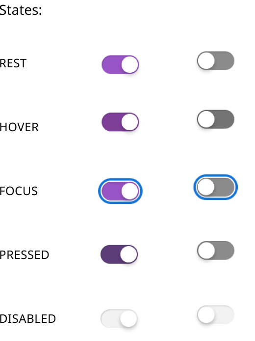
The style of the toggles was updated to meet color contrast, improve visibility for the toggle track and adopt a style that was more familiar to users.
Before:

After:

When users hover over cells with truncation, a hover effect is triggered, displaying the complete content. Initially implemented by developers, this feature posed accessibility challenges due to the blue icon's visibility against the dark background. To enhance contrast and keyboard accessibility, I modified the fill color and introduced a stroke to the container. Additionally, to facilitate interaction for keyboard users, I separated the icon from the container.
Before:

After:


MOLECULES
Similar enhancements were applied to the app switcher, including the addition of a stroke and adjustments to the fill colors, aligning it more seamlessly with the other components within the design system.
Before:
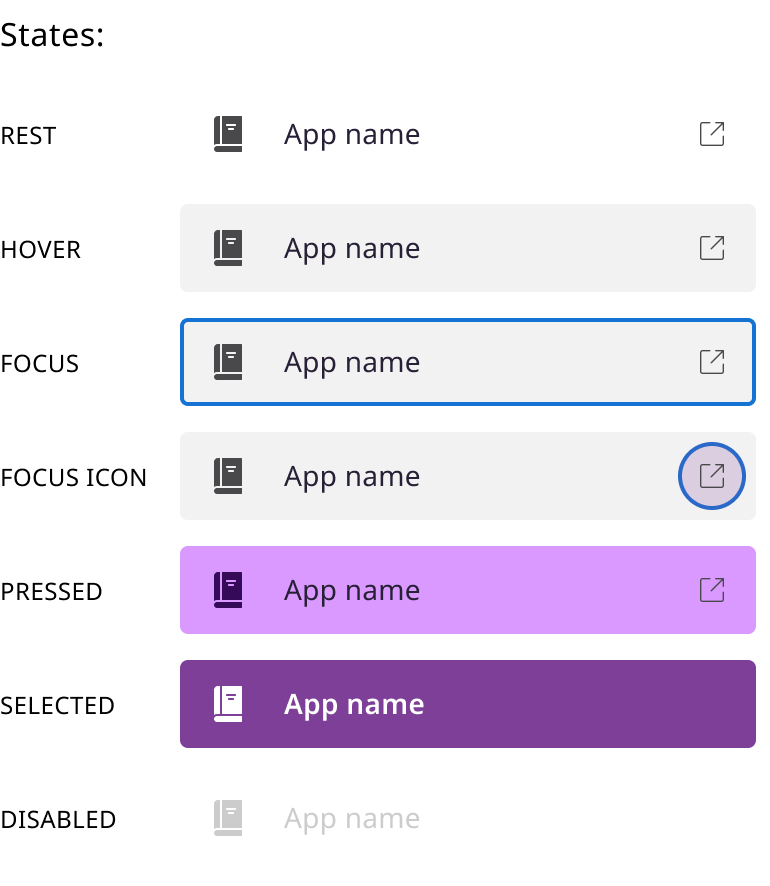
After:

In order to enhance the experience for all users, I improved the color contrast of selected dates and introduced keyboard-friendly input fields for easy date entry.
Before:

After:

It was important for the main CTA to be finding health care providers because it is one of the main issues women have when it relates to their health.
During interviews, participants made it clear the two most important factors they considered when searching for new doctors were health insurance and location. Many also said that depending on the specialty, gender, and sometimes race influenced their decision to see them as well.
The homepage needed to display the information and value users would get in a simple, yet informative way. I showed a preview of what they could expect by highlighting featured doctors, recent content, and popular forum topics.
After developers implemented all updates, the website was submitted for manual scanning of accessibility issues. While the results weren't perfect, the aforementioned elements passed! After receiving this feedback, the team, including product managers and developers, created a plan to make necessary changes and continue the journey toward becoming a more accessible company.
It was important for the main CTA to be finding health care providers because it is one of the main issues women have when it relates to their health.
During interviews, participants made it clear the two most important factors they considered when searching for new doctors were health insurance and location. Many also said that depending on the specialty, gender, and sometimes race influenced their decision to see them as well.
The homepage needed to display the information and value users would get in a simple, yet informative way. I showed a preview of what they could expect by highlighting featured doctors, recent content, and popular forum topics.